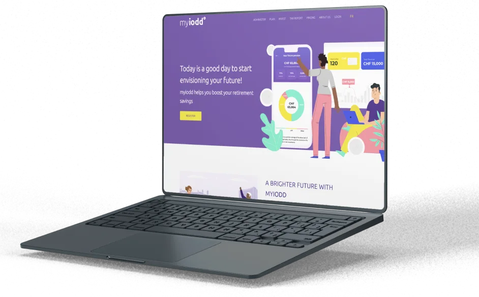
MyIODD

Retirement planning platform, boost savings & tax reporting
The platform is designed to help users boost their retirement savings and plan for a better future. Users can easily enter their personal details, income, and preferences, so the system can give them accurate financial advice. It includes features like investor profile, planning finances, reporting taxes, and saving money, making financial planning easier for anyone.- Location EU
- Industry FINTECH
- Team Size 6 people
- Duration 1.5 months
- Budget $30K

Challenges

The client approached us with an existing financial application that had UI/UX shortcomings.
The main feature of the application, the Tax Report, had poor usability and did not meet the needs of the target audience
The main challenges for users: a) a lengthy form, b) unclear questions, c) lack of rewards upon completion, d) misunderstanding the purpose of the questionnaire.
The client requested that to revamp the design concept and enhance the user experience of the application.
Solution
The Myiodd financial planning platform underwent a significant upgrade to improve user experience and engagement. We simplified the Tax Report questionnaire by using yes/no options and organizing it into a single easy-to-use page, allowing users to input their financial information quickly.
The platform’s new interface features a progress bar and user-friendly input fields, ensuring clarity and simplicity. We provide clear explanations of benefits and incentives for completing the questionnaire. Ongoing collaboration with the client includes continuous monitoring and user feedback integration to improve the functionality of the platform, ensuring the app meets user needs with a focus on user-friendly design and efficiency.

our input

UI/UX Design

Front-end Development

Back-end Development

Project management

Quality Assurance

Business analysis
RESULTS
We implemented solutions that led to a 30% increase in user engagement and a 60% reduction in questionnaire completion time, guiding clients towards brighter financial horizons.
- Increased user engagement30%

We improved user engagement by 30% through simpler processes and a better user experience.
- Days Implementation Timeline45

Our team made the changes in just a month and a half, showing we can work quickly without sacrificing quality.
- reduced questionnaire completion time60%

We cut the time it takes to finish the questionnaire in half, making it easier and faster for users to get things done.
App functionality


Pension and Tax Guidance

Financial Planning

Investment Profile

Saving Plans

Financial Assistance

Tax Savings options

Personalized Investment Recommendations

tax report questionnaire
how we did it
- After completing the UI/UX redesign, we increased user engagement by 30% and decreased questionnaire completion time by 60%.

Proof of Success
- Transparent communication and coordinated efforts resulted in improved product quality.

Team Synergy
- Our team created a solution tailored specifically to the needs of the target audience.

redesign challenge
- Thanks to our deep expertise in UI/UX, we delivered an intuitive and user-friendly solution.

expert guidance
- Success in the initial collaboration phase led to further product improvements.

ongoing partnership
- We maintained regular communication with the client, provided progress updates, and addressed their requests promptly.

Continuous Collaboration and Communication Match
Technologies
we used

Javascript

React

HTML5

CSS

PHP 5-7

Laravel
Creation Process
Consultation & Requirement Gathering
We conducted detailed interviews with the client to understand their objectives and challenges, gathering requirements that informed the creation of User Story artifacts. This phase laid the foundation for designing a platform that meets the client's needs effectively.
1User Story & use Case Development
Using the gathered requirements, our Business Analysis team crafted User Stories that outlined specific user interactions and functionalities. For example, one User Story described how users would use the platform, such as choosing an account type and entering information in fields, ensuring a smooth user experience post-registration.
2UI/UX Design for User Flow
With approved User Stories and Use Cases, our UI/UX team worked on designing a functional and user-friendly interface. By incorporating client feedback and adhering to best practices, we created a seamless user flow that enhances the overall platform experience.
3Development & Delivery
During the development phase, we translated the designed UI/UX into a fully functional platform, integrating features like account creation, onboarding questions, document uploading, and questionnaire completion flow. Rigorous testing and iteration provide the delivery of a high-quality product within the agreed timeline.
4Approval & Feedback Integration
Following development, the platform underwent thorough testing and review with the client. We integrated feedback and suggestions to refine and optimize the platform further, ensuring alignment with client expectations and user needs.
5


